Let's cut to the chase: yes, clients read progress reports — but only if they're visual, easy to digest, and feel worth saving.
A 3-paragraph email with raw numbers? They'll skim it, say "thanks," and forget it by tomorrow.
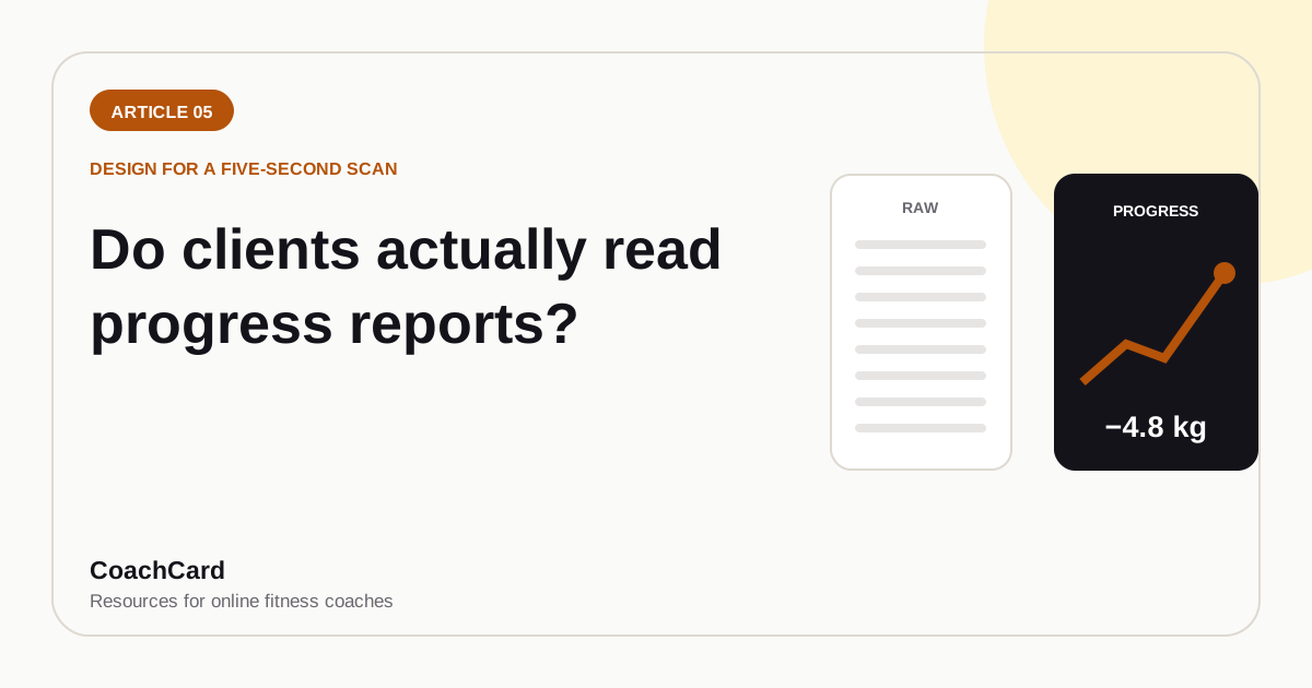
A beautifully designed progress card with a chart, their wins highlighted, and your personalized note? They'll screenshot it. Save it. Share it on Instagram. Come back to it when motivation dips.
The question isn't whether clients read progress reports. It's whether you're giving them something worth reading.
The Surprising Answer: Yes — If They're Visual and Easy
Here's what we know from watching thousands of coaches and clients:
Clients skip:
- Walls of text
- Raw spreadsheets
- PDFs with tables of numbers
- Email threads buried in their inbox
Clients save and share:
- Before/after cards
- Progress visuals with charts or graphs
- Personalized notes formatted as a "report"
- Anything that looks professional enough to post
The content can be identical. "You're down 2.4 lbs this month, waist is down 1.2 inches, and you hit 18/20 workouts." Same data.
But deliver it in a spreadsheet? Ignored.
Deliver it as a clean, visual card with a trend graph and your note? Saved, shared, celebrated.
The format is half the value.
What Clients Skip (And Why)
Let's talk about what doesn't work — because most coaches are still doing it.
1. Google Sheets and raw data
No client has ever been excited to open a spreadsheet. Ever.
Yes, you need a spreadsheet for your own tracking. But sending clients a link to their data tab and expecting them to feel inspired? That's not coaching. That's data entry.
2. Walls of text in email
A 5-paragraph email that starts with "Hey Sarah, great week! Let's dive into the numbers..." gets skimmed at best.
Why? Because it's not scannable. There's no visual hierarchy. No clear takeaway. It reads like homework.
3. PDFs with tables
Slightly better than a spreadsheet. Still boring. Still feels like a lab report, not a progress milestone.
PDF reports can work — but only if they're designed well. Most aren't.
What Clients Save and Share (And Why It Matters)
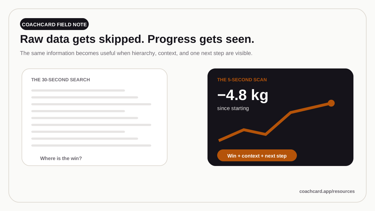
Now let's talk about what works. What makes clients not just read the report, but feel proud of it.
1. Before/after cards
These are catnip for clients. A side-by-side photo with their stats overlaid (weight, measurements, weeks elapsed). Clean design. Big numbers. Visual proof.
Why it works: It's shareable. Clients post these to Instagram stories. That's public accountability for them. Free marketing for you.
2. Progress visuals (charts, graphs, trend lines)
A simple line chart showing weight or body fat % over time is 10x more motivating than a table of numbers.
Why? Because humans are visual. A downward trend line feels like progress. A table of "152.4, 151.8, 151.2" just feels like numbers.
3. Personalized cards with data + your note
This is the gold standard. A designed card (think: Instagram post format) with:
- Their key numbers (weight, measurements, adherence)
- A visual element (chart, icon, color-coded badge)
- Your personalized note ("You crushed this week...")
- Branding (your logo, your colors)
Why it works: It feels official. Like a real progress report. Not a text message. Not a spreadsheet. A tangible artifact they earned.
The Instagram Effect (Why Shareable Reports = Free Marketing)
Here's the business case for making your progress reports beautiful:
When a client posts their progress report to Instagram, two things happen:
1. Public accountability for them
Posting progress publicly increases commitment. Their friends see it. Their family sees it. Now they have social pressure to keep going. That's a retention boost for you.
2. Free marketing for you
Every progress card they share is a testimonial. It shows your brand. It shows that you deliver results. And it shows that your clients are proud enough to post about it.
Compare that to a spreadsheet buried in their Google Drive. No one's posting that. No one's talking about it. It's invisible.
The shareable report is both a coaching tool and a marketing asset. That's why the format matters.
The Psychology: A Tangible Artifact = A Commitment Device
There's a deeper reason visual reports work: they're tangible.
Progress that lives in a spreadsheet feels abstract. It's data. It's something you know intellectually, but don't feel.
But a progress card saved to your phone? That's real. You can scroll back through them. You can see the trend. You can show your partner, your friend, your coworker.
It becomes proof that this is working. Not just for the coach — for the client.
And when doubt creeps in (which it always does), they can pull up those saved cards and remember: "Oh yeah. I was down 8 lbs last month. I am making progress."
That's the psychology of a tangible artifact. It's a commitment device. A reminder. A trophy.
Case Study: Spreadsheet Reports vs Visual Cards
Let's look at a real comparison (anonymized, but the numbers are real):
Coach A: Sends check-in feedback as email summaries with a link to the client's Google Sheet for full data.
- Average client retention: 65% at 6 months
- Client survey response: "I wish I could see my progress more clearly"
Coach B: Sends beautifully designed progress cards every week with data, charts, and a personalized note.
- Average client retention: 82% at 6 months
- Client survey response: "I love seeing my progress cards — I save every one"
Same coaching quality. Same programming. Same price. The only difference? How they delivered progress reports.
17% better retention from a format change. That's 3-4 extra clients retained per year for every 20 you start with. At $150/month, that's an extra $7,200-9,600 in annual revenue.
The format isn't a nice-to-have. It's a retention tool.
What Makes a Report Clients Actually Want
So what's the checklist? If you're designing progress reports (or choosing a tool that does), here's what matters:
✅ Visual hierarchy
The most important number should be the biggest. Use size, color, and position to guide the eye.
✅ Scannable in 5 seconds
They should be able to glance at it and know: "Am I winning this week or not?"
✅ Data + narrative
Numbers prove it. Your note interprets it. Both are required.
✅ Chart or graph (when relevant)
A trend line showing 4-8 weeks of data makes progress feel real.
✅ Shareable format
1080×1080 or 1080×1920 (Instagram post or story size). Clients should be able to screenshot and post with zero editing.
✅ Professional design
It doesn't have to be fancy. But it should look intentional. Clean fonts, consistent colors, no clutter.
If your report checks these boxes, clients will read it. If it doesn't, they'll skim and forget.
You Don't Need to Be a Designer
The good news: you don't need Photoshop skills to make this work.
Tools like CoachCard are built specifically for this. You input the check-in data, the tool generates a beautiful progress card (with chart, personalized note, and your branding), and you send it. 60 seconds per client.
Your clients get a report they'll actually read, save, and share. You get your time back. And you both win.
Make Reports Your Clients Show Off — Try CoachCard
CoachCard creates beautiful, shareable progress reports from your check-in data in 60 seconds.
→ Try CoachCard free — no card required
The Bottom Line
Clients don't ignore progress reports because they're unmotivated. They ignore them because most progress reports are boring.
Spreadsheets are for you. Visual cards are for them.
If you want clients to feel their progress, celebrate their wins, and stick around past the 90-day cliff — give them something worth reading. Something worth saving. Something they're proud to show off.
That's what retention looks like. And it starts with how you deliver the data.